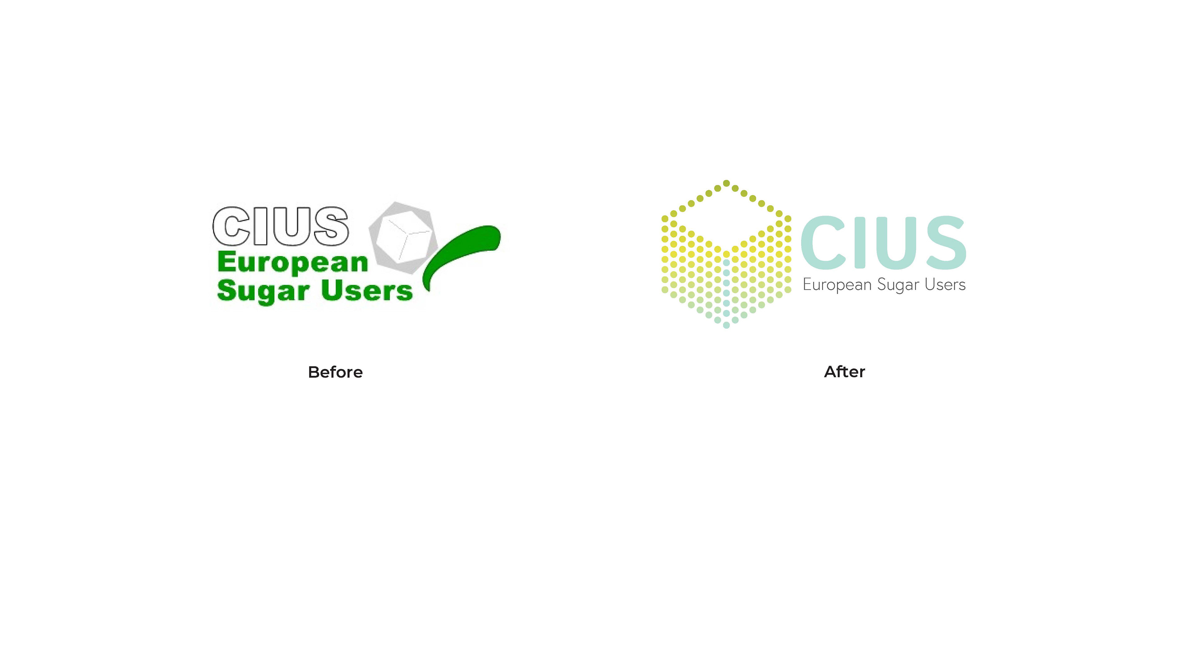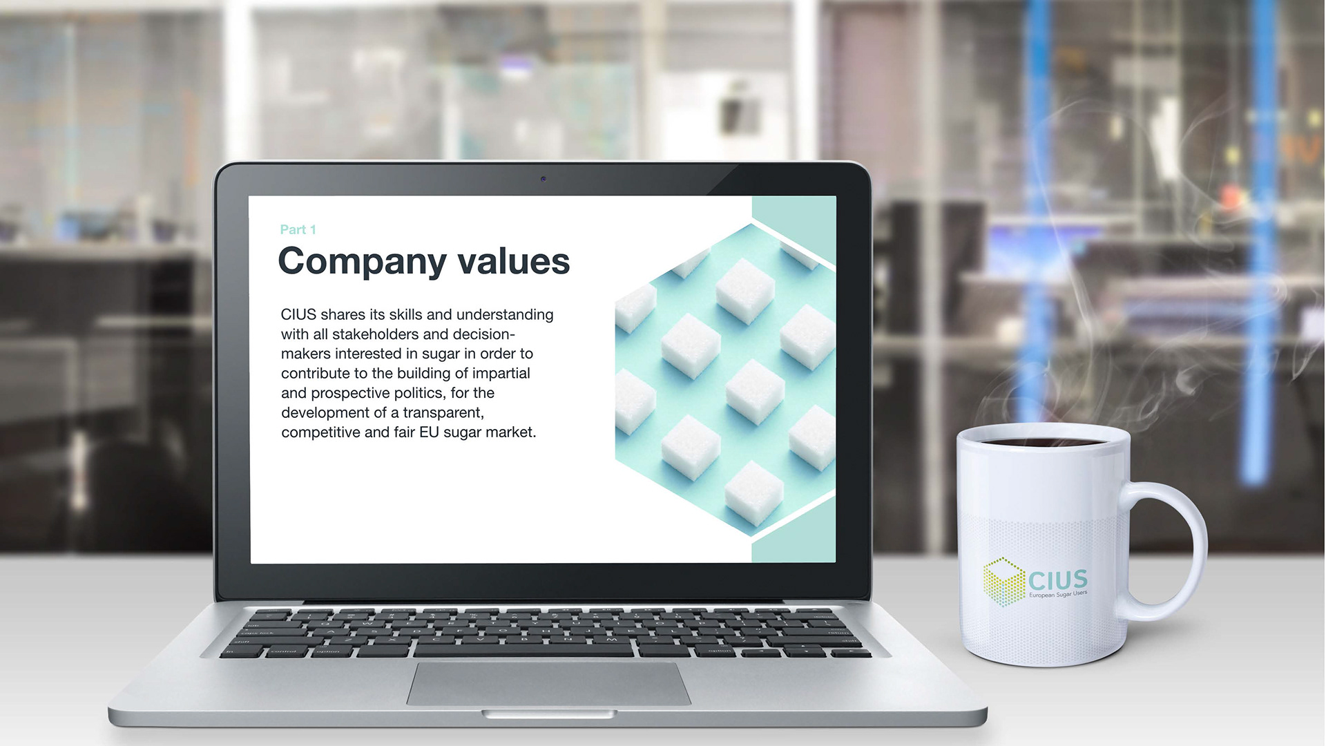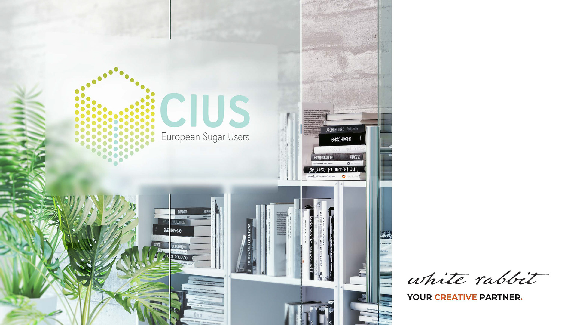
CIUS is the Committee of European Sugar Users. They represent the European sugar-using food and beverage industries, including artisans small and medium sized enterprises as well large multi-nationals.
Assignment:
The main goals of this project was to provide a modernised brand identity for CIUS, including the new logo and users interfaces for their new website.
Insight:
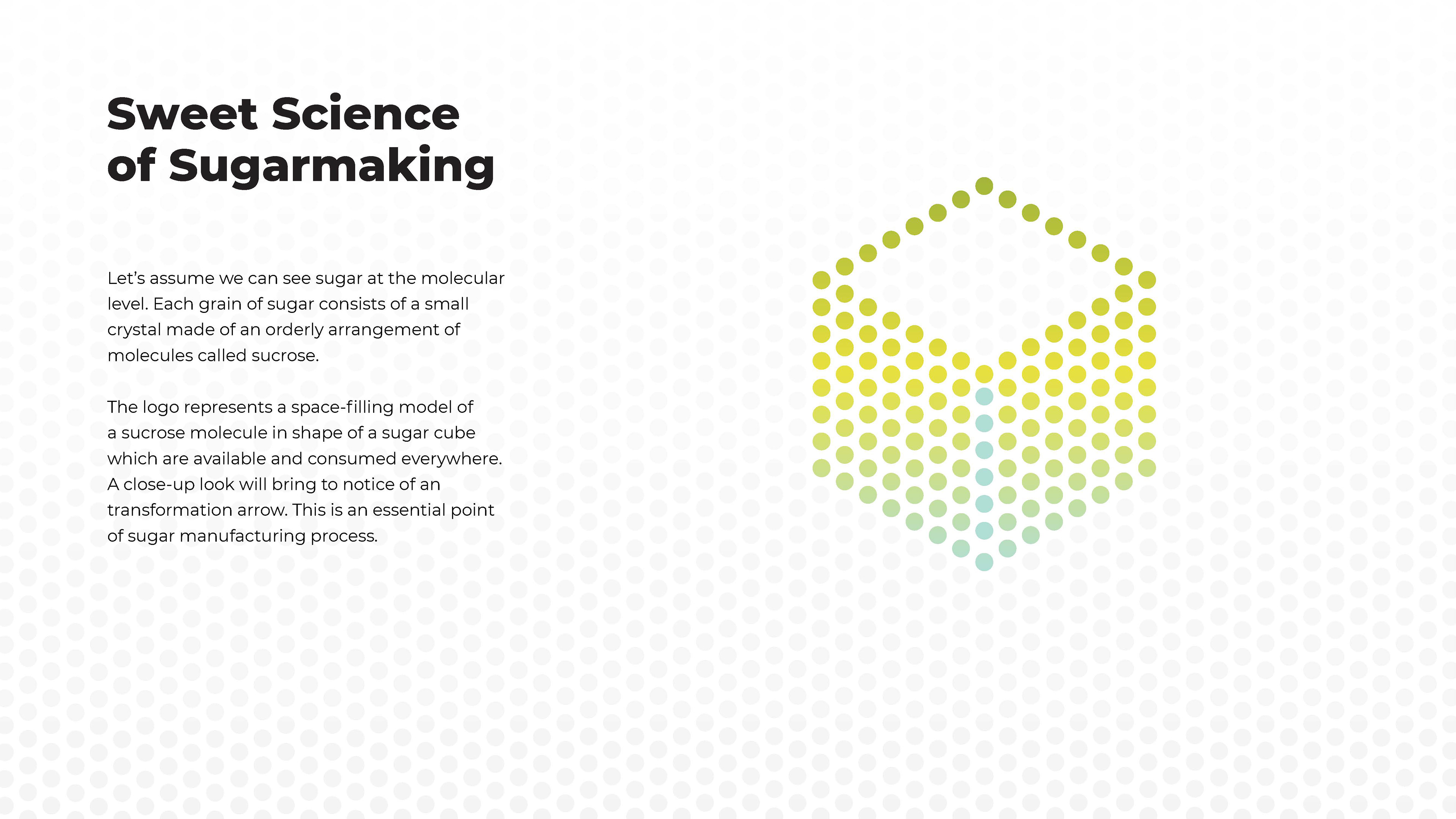
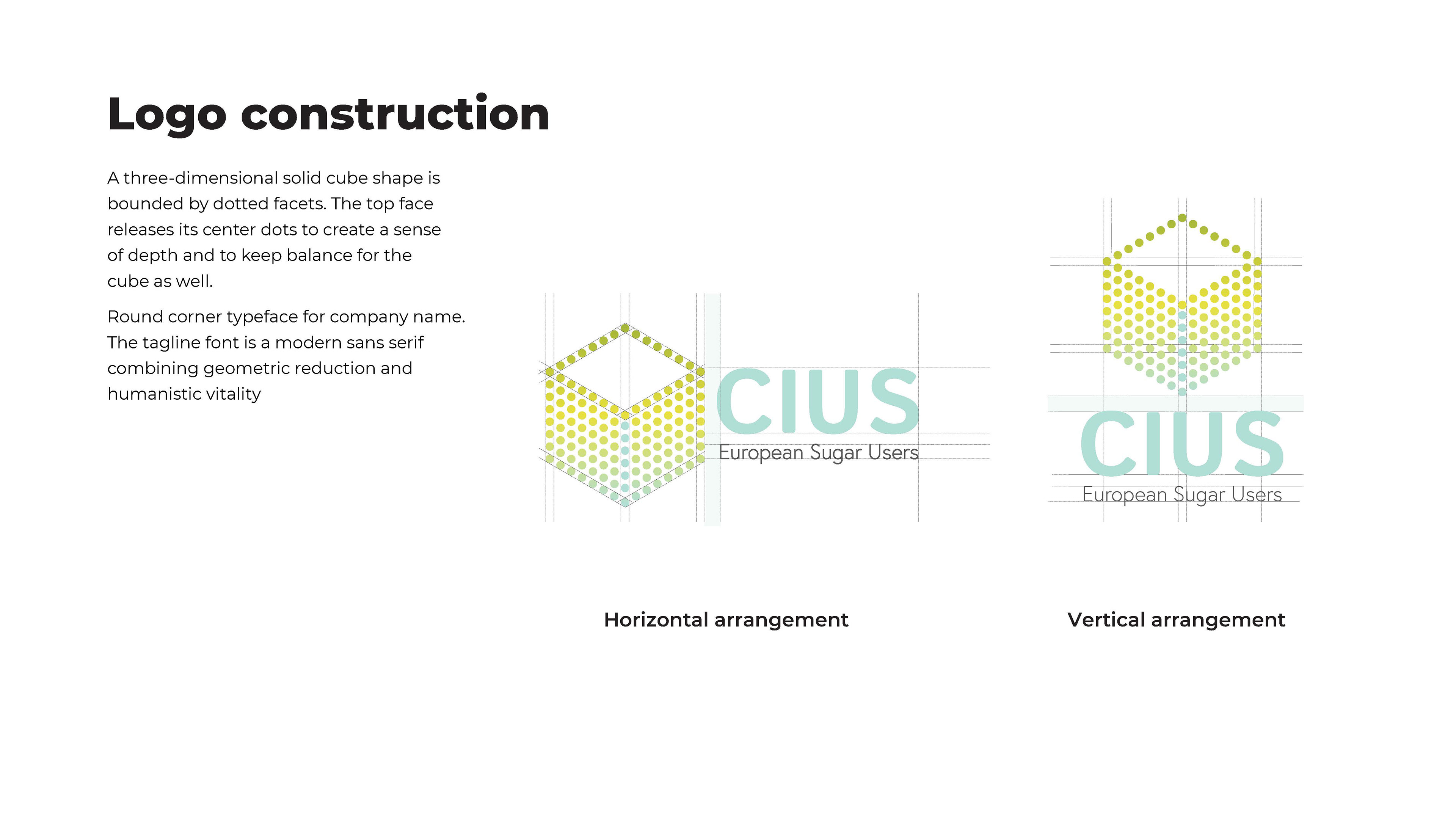
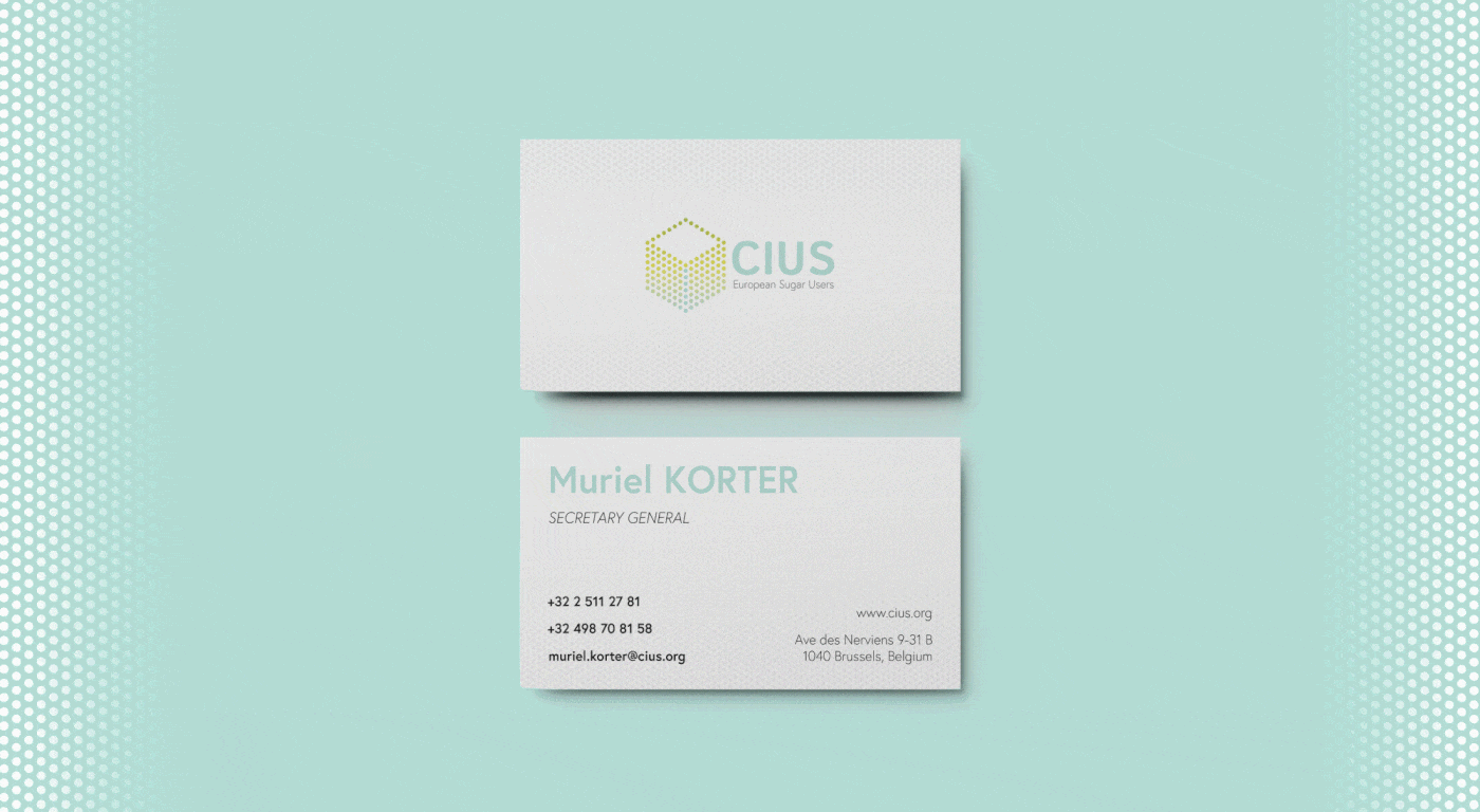
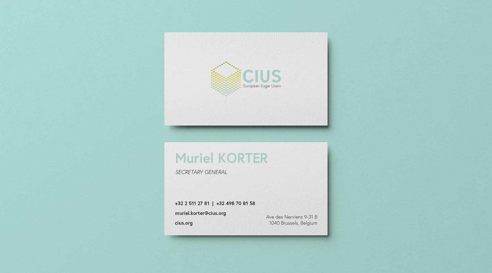
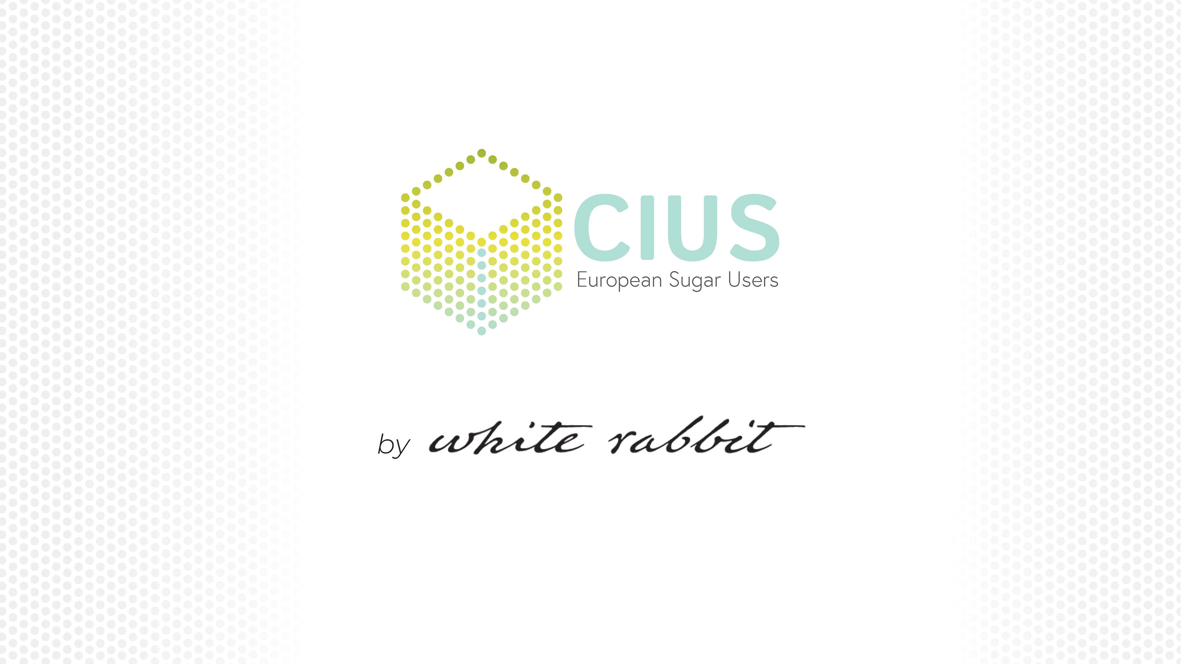
The new logo takes the shape of a sugare cube, reinforced by the dotted pattern. The sugar refining process is represented by the color gradient which forms an arrow from top to bottom.